

Year
Armada
2025
Client
Armada Construction Group
The Challenge
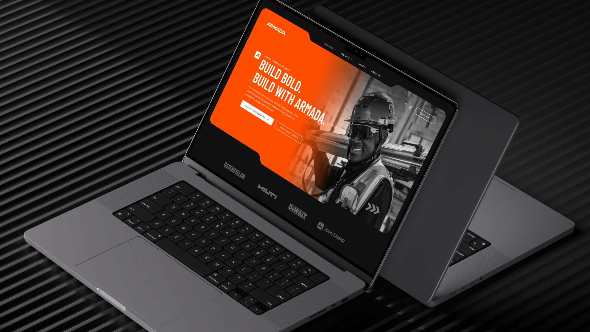
Armada Construction Group, a bold new force in the heavy construction industry, needed a brand that could command attention while staying grounded in grit, precision, and professionalism.
With a name rooted in power and unity, the visual identity had to evoke strength, reliability, and forward momentum. The goal was to develop a brand that felt modern yet built for legacy—something that could scale across worksites, gear, digital platforms, and public perception.
From logo to hardhat, every touchpoint was an opportunity to redefine what modern construction branding could look like.
Logo Design
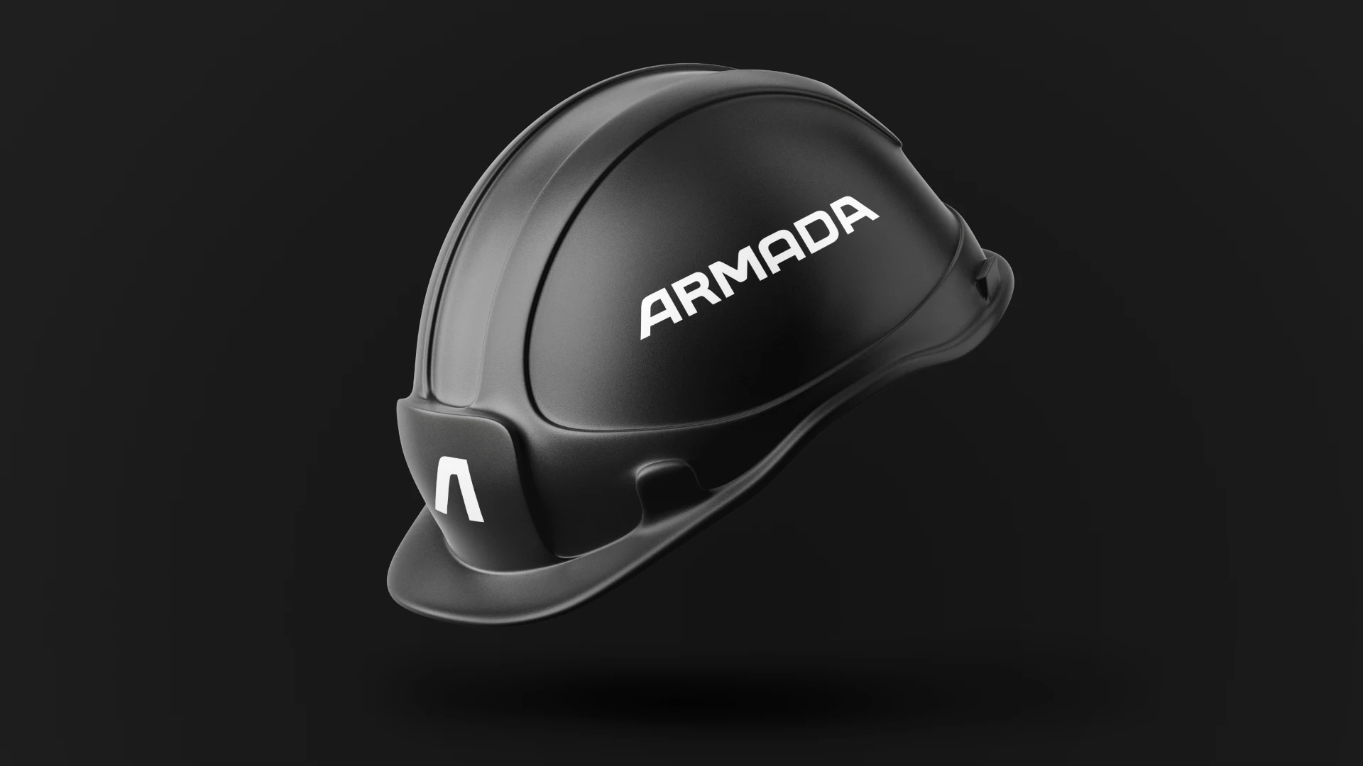
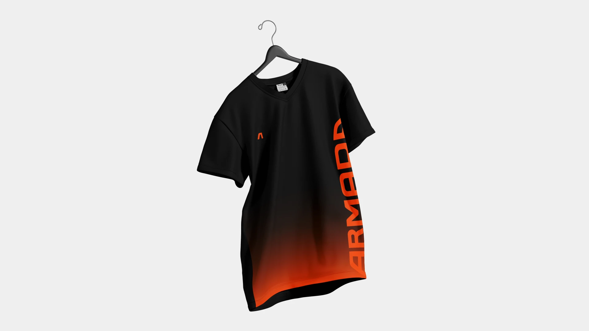
The Armada logo is an emblem of strength, movement, and cohesion. The stylized “A” icon represents a forward-driving force—leaning into progress with bold symmetry. It’s built for recognition, even at a distance, whether it’s stamped on a jobsite trailer or stitched onto a uniform.
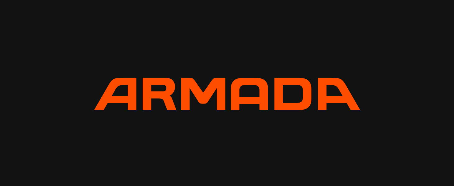
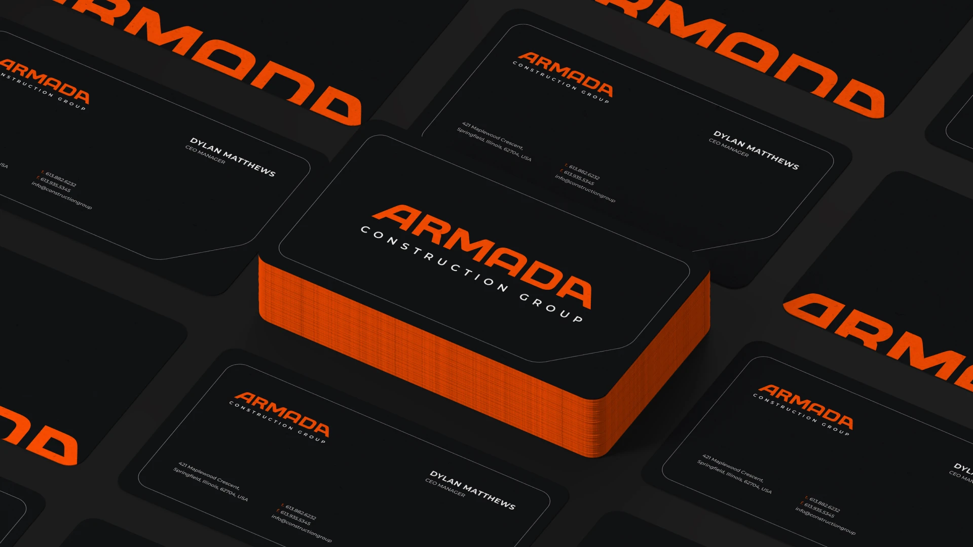
The wordmark uses custom, angular typography designed to mirror the structural integrity of steelwork and the deliberate force of industrial machinery. Set in clean white against punchy orange or matte black, it reflects clarity and confidence.
The full identity system includes:
- Primary and secondary logos
- Hardhat and gear applications
- Construction signage
- Digital and print consistency
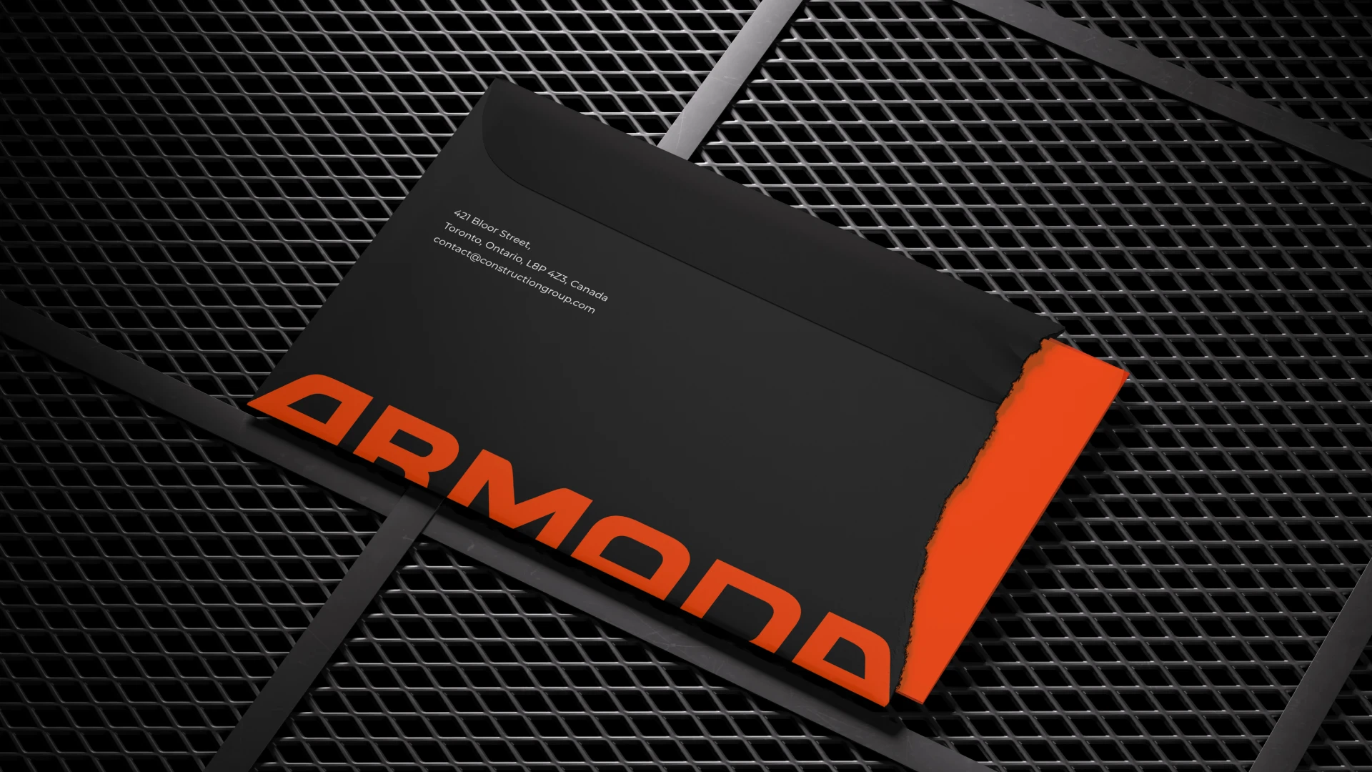
Brand Guidelines & Stationery
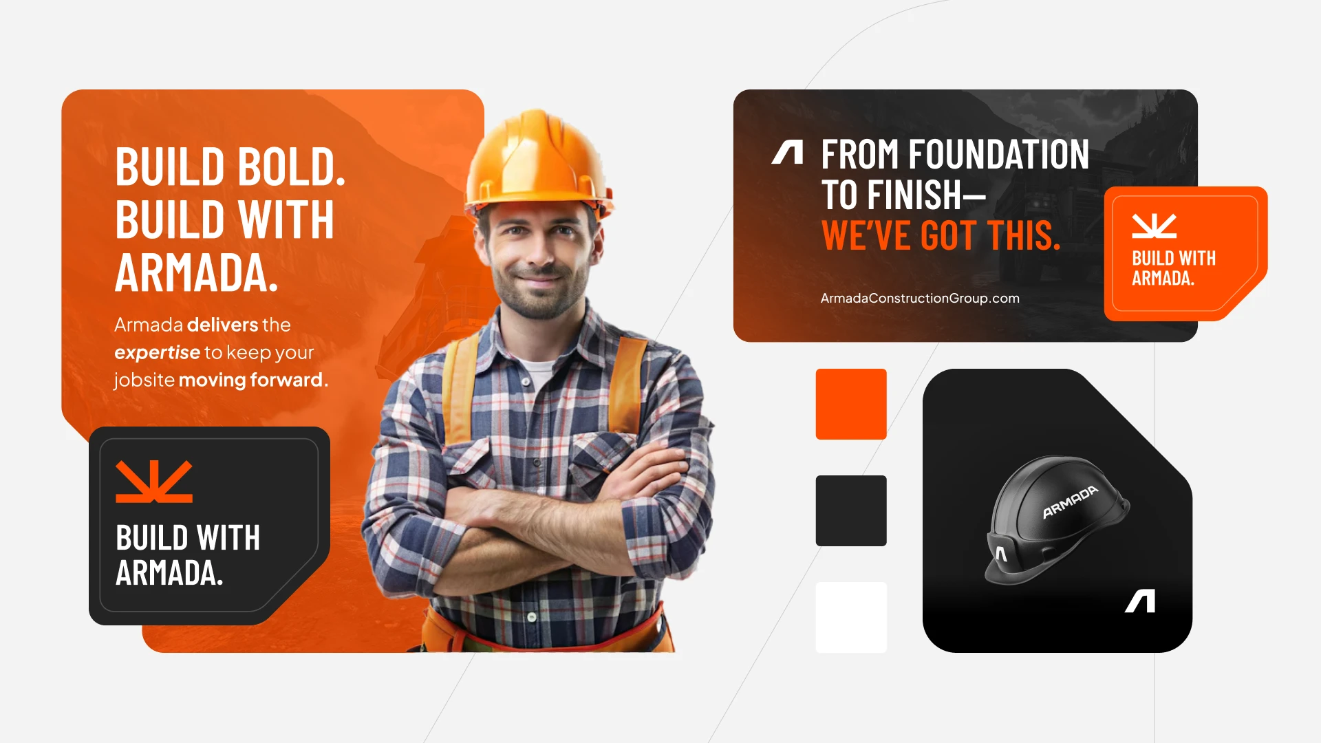
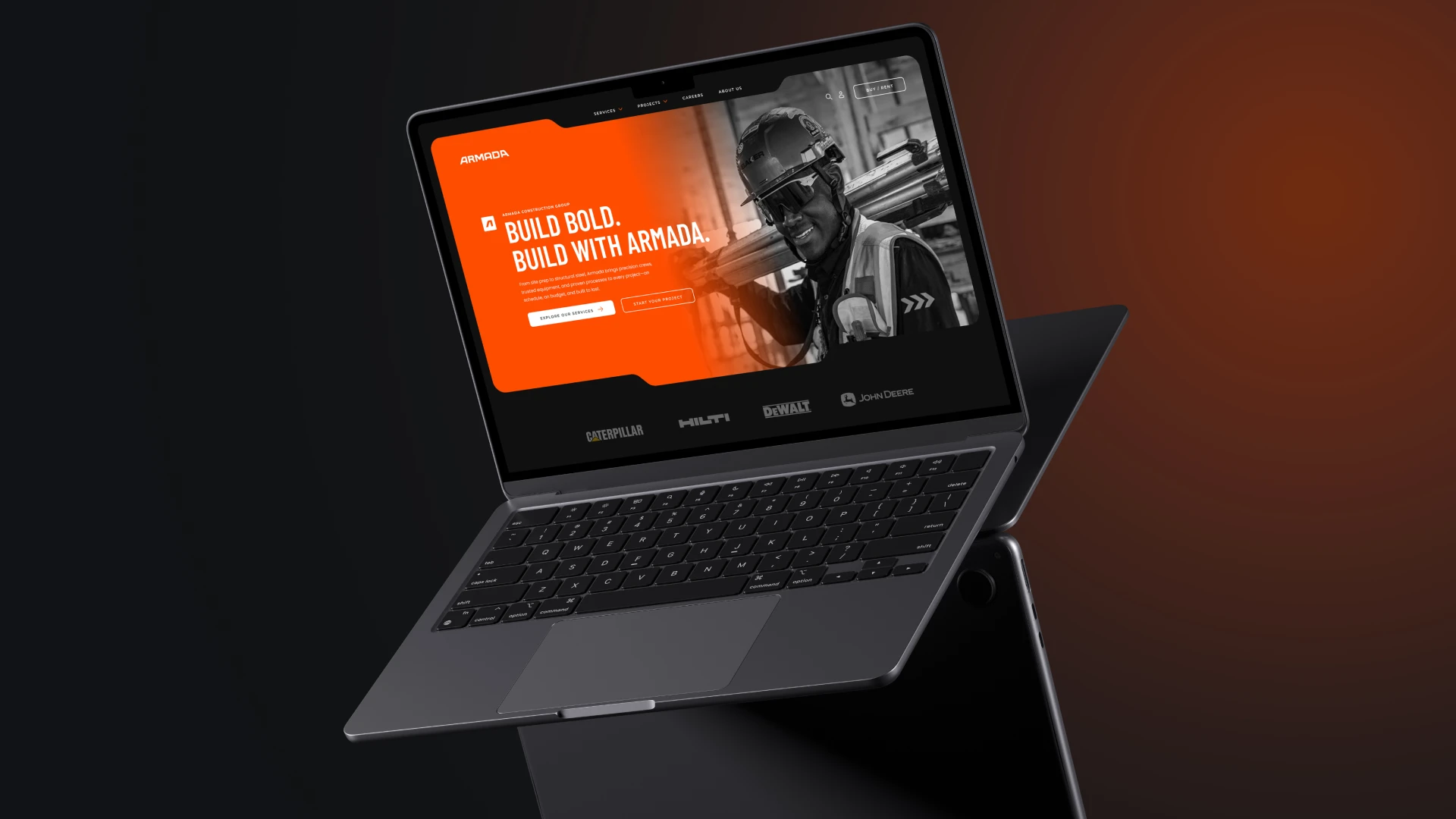
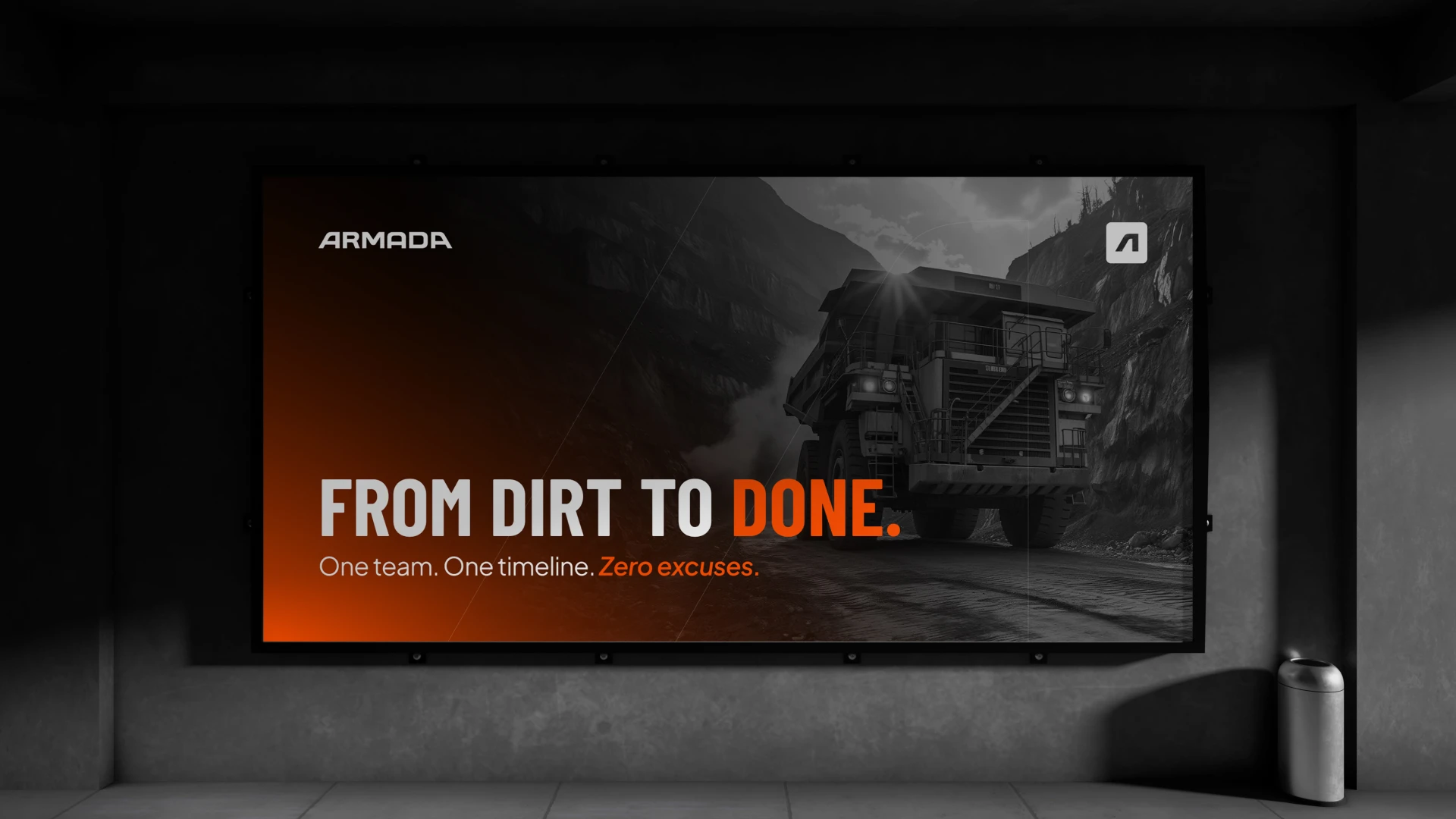
Armada’s brand voice is assertive and to the point. Headlines like “From Dirt to Done” and “Build Bold. Build with Armada.” speak to an audience that values execution over excuses.
Visually, the palette leans on safety orange and industrial black, balancing high-visibility practicality with design-forward edge. Bold typography, hard shadows, and desaturated imagery create a no-nonsense aesthetic that still feels premium.
Photography direction focused on real moments—boots on the ground, steel in hand, sweat and resolve on display. The brand doesn’t talk about hard work. It shows it.
The Result
Armada now stands as more than a construction company—it’s a recognizable force. The brand system unifies every touchpoint, from field crews to client presentations, under a single, bold visual flag. It’s tough, distinct, and ready to scale with the company’s ambition.

Eden Exotics
Eden Exotics

OSO
OSO

Mayfield
Mayfield

WASHING BANK
WASHING BANK

NIKE EXPERIMENTAL